

Spacing & Increments
Spacing Guidelines & Usage
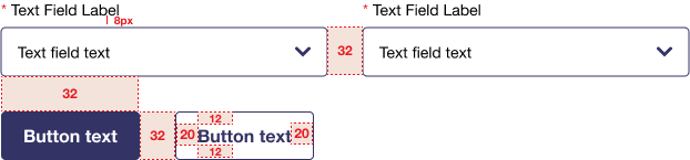
The USPS Digital Style Guide uses spacing units based on multiples of 4 pixels.
- Padding is the spacing inside a component around the content. For example, in a button component, the text label should have 20px of padding to the left and right and 12px above and below.
- Margin is the spacing outside of a component that separates it from other components. For example, there should always be a margin of 32px between two buttons, or between a button and a form field.
These usage notes and guidelines aren't exhaustive.
Spacing Variable Name |
Spacing Variable Size |
Spacing Variable Usage Notes and Guidelines |
|---|---|---|
USPS-spacing-4 |
4 pixels |
|
USPS-spacing-8 |
8 pixels |
|
USPS-spacing-12 |
12 pixels |
|
USPS-spacing-20 |
20 pixels |
|
USPS-spacing-24 |
24 pixels |
|
USPS-spacing-32 |
32 pixels |
|
USPS-spacing-48 |
48 pixels |
|
USPS-spacing-80 |
80 pixels |
|
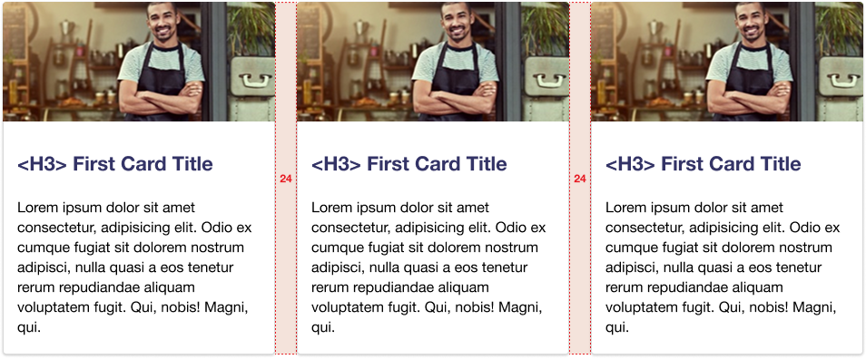
Spacing Examples
Border Radius Guidelines & Usage
USPS border radius increments are based on multiples of 4 pixels.
Border Radius Variable Name |
Border Radius Variable Size |
Border Radius Variable Usage Notes and Guidelines |
|---|---|---|
border-radius-xsm |
4 pixels |
|
border-radius-sm |
8 pixels |
|
Border Radius Examples

Instance of xsm corner radius for text input fields |

Instance of xsm corner radius for buttons |
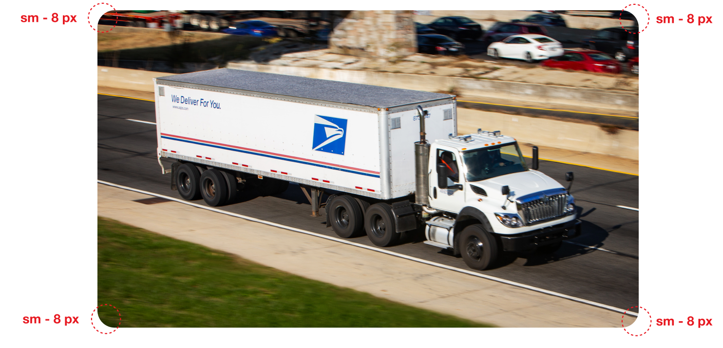
Instance of sm corner radius for images with rounded corners
