

Application Components
Form Field Elements
Radio Buttons
These components are used for forms, tools, and applications; they typically are not used on the static USPS.com® website, though some are used on The Postal Store® and other ecommerce and marketing sites.
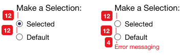
Radio Buttons are used when there are a limited number of options to choose from and the customer needs to make a single selection (options are mutually exclusive). For 6 or more options, use a dropdown list instead.
Radio Buttons should be vertically aligned unless there is a specific business or use case for horizontal alignment. Additionally, the use of a visible Input Field title is not required, but semantic grouping is.
Radio Button Specifications
Checkboxes
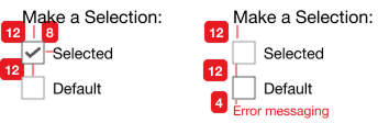
Checkboxes are used when the customer can make one or multiple selections from the available options. Checkboxes should be vertically aligned unless there is a specific business or use case for horizontal alignment.
Like Radio Buttons, the use of a visible Input Field title is not required, but semantic grouping is. Unlike Radio Buttons, checkboxes can be arranged in columns when there are a larger number of options.
Make a Selection:
Make a Selection:
Checkbox
Width: 20px
Height: 20px
Padding: 0px
Outline: Dark Grey #595959
Background: White #FFFFFF
Radio Button Grouping Label
Font: Inter
Style: 16px, Title Case
Color: Black #000000
Margin: Bottom 4px
Checkbox Text
Font: Inter
Style: 14px, Title Case
Color: Black #000000
Padding-left: 8px
Error State
Font: Inter
Style: 12px, Sentence Case
Color: USPS Brand Red #DA291C
Margin: Top 4px
Checkbox Specifications
Toggles
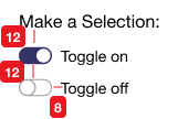
Toggles are a digital switch that let users select between two mutually exclusive options. They are typically used for preferences or selecting between two states.
Make a Selection:
Make a Selection:
Toggle Grouping Label
Font: Inter
Style: 16px, Title Case
Color: Black #000000
Margin: Bottom 4px
Toggle On
Width: 30px
Background Color: USPS Brand Blue #004B87
Circle Background: White #FFFFFF
Circle Outline: 1 px; USPS Brand Blue #004B87
Toggle Text
Font: Inter
Style: 14px, Title Case
Color: Black #000000
Padding-left: 8px
Toggle Off
Width: 30px
Background Color: White #FFFFFF
Background Outline: 1 px; Hover Gray #999999
Circle Background: White #FFFFFF
Circle Outline: 1 px; Hover Gray #999999
Toggle Specifications
Text Input Fields
There are diverse uses of Input Fields including single-line discrete free-text form fields (e.g., First Name), multi-line comment or description fields (e.g., Special Instructions), and search.
Input Fields may include features such as spellcheck, blocking special characters, auto complete/auto suggest, and remaining character counters.
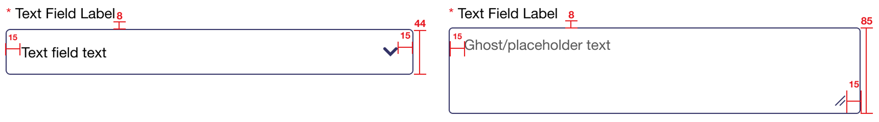
Text input fields always have an absolute height of 44 pixels.
Input Field
Width: Variable
Height: 44px (Absolute)
Padding: ~px 15px ~px 15px (Vertically Centered)
Border: 1px, Black #000000
Border-radius: 4px
Background: White #FFFFFF
Field Label
Font: Inter
Style: 14px, Title Case
Color: Black #000000
Margin: Bottom 8px
Field Text
Font: Inter
Style: 14px, Title Case
Color: Default: Black #000000; Ghost / placeholder text: Hover/Form Field Gray #999999
Error State
Background: White #FFFFFF
Border: 1px, USPS Brand Red #DA291C
Font: Inter
Style: 12px, Sentence Case
Color: USPS Brand Red #DA291C
Text Input Fields With Icons
Text input fields can have icons to indicate specific functionality within the text field.
Dropdowns
Use Dropdowns when a customer has multiple options to choose from, for instance when selecting a state. They’re especially useful when space is limited.
Most Dropdowns across USPS.com only allow a single dropdown list option; however, there are a few exceptions (e.g., the Missing Mail Color Dropdown).
Input Field
Width: Variable
Height: 44px (Absolute)
Padding: ~px 15px ~px 15px (Vertically Centered)
Border: 1px, Black #000000
Border-radius: 4px
Background: White #FFFFFF
Chevron: /assets/images/dropdown-caret.png
Field Label
Font: Inter
Style: 14px, Title Case
Color: Black #000000
Margin: Bottom 5px
Field Text
Font: Inter
Style: 14px, Title Case
Color: Default: Black #000000; Ghost / placeholder text: Hover/Form Field Gray #999999
Error State
Background: White #FFFFFF
Border: 1px, USPS Brand Red #DA291C
Font: Inter
Style: 12px, Sentence Case
Color: USPS Brand Red #DA291C
Text Area Fields
Text area fields with and without the optional re-sizing component.
Text and Text Area Field Specifications
Text Input Label Variations
Text input field labels have 4 variations.
- Just the text field label: required and not required
- Text field label with optional use current location; required and not required
Progress Bar & Application Steps
Some applications appear on a single screen while other span multiple screens.
Step-based applications use a modified <H2> with a non-bold step identification followed by a bold step title. In order to keep forms as short as possible, detailed step-specific instructions or explanations are often provided via an Information Icon with a popover.
Multiple screen applications typically use a progress bar, however, it is not required. Progress bars are not used with singlescreen applications.
Progress bars are left-aligned and can extend to the full screen width, but are not required to do so. The progress bar indicates the current and completed steps with USPS Brand Blue (#004B87), while future and incomplete steps are indicated in gray (#D8D8D8). A step indicator (i.e., “Step # of #”) appears above the current step bar on desktop and is left-aligned on mobile.
Instance of progress bar with application steps for desktop
Pagination & Results Per Page
Search and applications that leverage search-based and form-filter-based listings of results that are presented across multiple screens utilize standardized pagination and results per page fields.
Pagination
Pagination is based on the number of results screens. The Pagination array shows up to five (5) results plus directional chevrons to assist users in navigating to next and previous results. “Next” and “Previous” labels may be included, but are not required.
USPS Brand Red (#DA291C) chevrons indicate additional results in that direction (left or right). Gray chevrons indicate no additional results in that direction. The current result set is indicated with a USPS Brand Blue (#004B87) circle and contrasting White (#FFFFFF) text.
Instance of pagination array component
Results Per Page
Some search- and filter-based results listings allow the user to determine the number of results to list per screen (page). When this functionality is included, a standard dropdown is used to allow the user to select from presets.
Results Per Page:
Instance of pagination dropdown component
Transparent Overlays
Typically used with modals, transparent overlays consist of a USPS Digital Blue #000000 fill at 50% opacity.
Information Icon with Popover (Tooltip) & Modal
Depending on use and context, information icons can be used with either a popover (tooltip) or a modal. Modal boxes appear atop the main screen content and require user interaction to close. This interaction typically includes acknowledging an alert or warnng, making some kind of selection, or providing required inputs. Modals include a close "X" icon at the top right of the modal box, this close "X" icon is required even if the modal presents the user with a binary selection (yes/no, agree/exit, etc.).
This is an active info icon with a popover
(HTML-based).


Desktop
On desktop, the modal box is 800 px wide and horizontally centered.
This is an active information icon with a modal.
Modals boxes appear atop the main screen content and require user interaction to close. This interaction typically includes acknowledging an alert or warning, making some kind of selection, or providing required inputs. Modals typically include a close “X” button at the top right of the modal box, but this close button is not required if the modal presents the user with a binary selection (yes/no, agree/exit, etc.). On desktop, box is horizontally centered; on mobile it extends full width only revealing the overlay above and below the box.
Example: This is an active information icon with a modal.
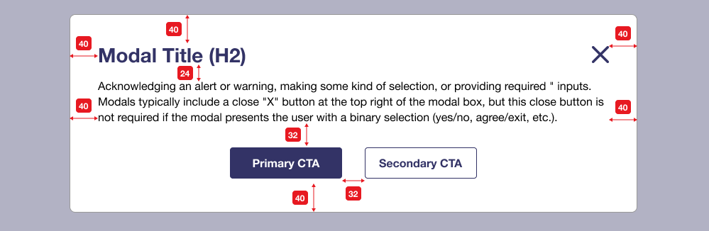
Instance of modal component for desktop
Mobile
On mobile, the modal box is horizontally centered with 8px spacing on both sides.
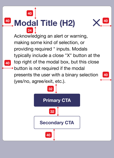
Instance of modal component for mobile
Loader/Processing Modal
Loaders are displayed as part of a modal and inform the user that processing is occurring behind the scenes or that content is being loaded on the screen. This component is responsive and works on desktop or mobile screens.
Instance of loader/processing modal component
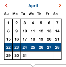
Calendar
Calendars are presented as singlets (a single month), diptychs (two months side-by-side), and triptychs (three months side-by-side). They can either be displayed as an element within a screen or as a tooltip.
When required, users may scroll to previous or subsequent months using the previous and next navigation chevrons at the top of the calendar widget. For singlets, this appears in line with the month heading. For diptychs and triptychs, the navigation chevrons are vertically centered on the left and right of the calendars.
Dates that can be selected appear with a white (#FFFFFF) background. Dates that cannot be selected appear with a Dark Background Gray (#D8D8D8) background. Selected (or current) dates appear with a USPS Brand Blue (#004B87) background (with white text).
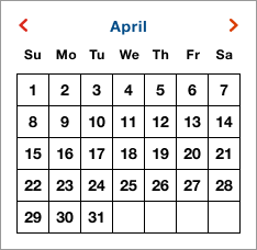
Instance of calendar with unselected dates
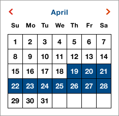
Instance of calendar with selected dates
Instance of calendar tooltip with selected dates
Calendar Tooltip
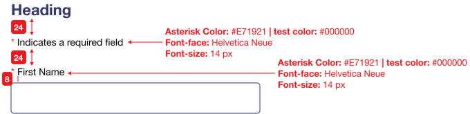
Required Fields
Required form fields should always be indicated with an asterisk (*) leading the form field element label, as well as a “* indicates a required field” notification should be listed at the beginning of the form, as illustrated below.
Note: Identifying only non-required form fields is not an allowable pattern (i.e., all fields are required unless indicated otherwise).
Quantity Picker
This component is typically used for adjusting cart item quantity, but it can also be used when requiring users to make any numeric quantity selection (note: not for use with date or year selectors).
